Good news this week for the world’s taxi drivers. Suddenly after months of aggressive market expansion Uber looks vulnerable and all of it is self-inflicted.
At the start of February, Uber launched a new corporate identity along with a nonsensical video to explain the move.
The response has been uniformly negative with most critics rejecting the logo for the usual reasons. Its too abstract. It looks too much like the Death Star. It looks mysteriously similar to Circle CI’s logo – a company that shares an office with Uber. These, and many more criticisms quickly appeared.
As a man with no training whatsoever in corporate identity or graphic design, I cannot comment. To me the difference between Uber’s new logo and the one it replaced, and indeed the one that preceded that, all appear pretty arbitrary. More interesting is the manner in which the logo was developed and what that tells you about Uber. It tells me that, despite the $40 billion valuation, Uber are potentially about to screw up. Badly.
For starters, there is the simple fact that the logo appears to have involved significant amounts of Travis Kalanick’s time. According to Wired magazine, Uber’s CEO has spent the last three years working alongside Uber’s design director Shalin Amin and a dozen or so others, “hammering out ideas from a stuffy space they call the War Room”. As part of that process Kalanick studied design concepts like color palettes and font kerning. “I didn’t know any of this stuff,” Kalanick tells Wired.
Kalanick has bigger fish to fry than corporate design. I’d argue even five minutes of his time spent on font spacing is a crime when he is faced with bigger issues like, oh I don’t know, the fact that his company is losing $1 billion a year in China or banned from operating in Spain and South Korea.
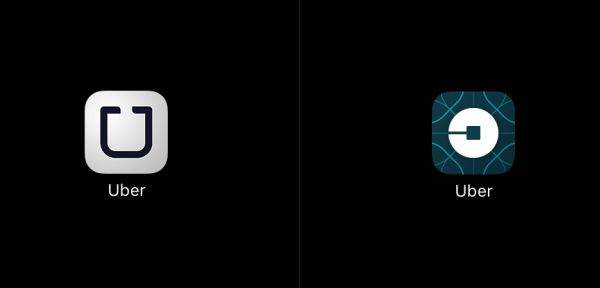
“The way Amin saw it, Uber’s branding problems were manifold. For one, the company had two logos — one with a U inside a box on the Android app, and one with a U and no box on the Apple app. The letters in the UBER wordmark were too widely spaced, and the U had an unsightly twist on its left prong. What’s more, the lettermark — the stylized, upper-case “U” — looked awkward beside the wordmark. “It read U-UBER,” says Amin, “like ‘Oooober.’”
This kind of myopic, design driven minutiae drives me insane. It’s not that fonts and pantones don’t matter, it’s just that they rarely matter enough to ever necessitate organizational effort. And when they start to represent the main branding “problem” for a company these minor design issues obscure more important branding issues.
What is Uber’s brand position? What are the brand perceptions among its target segments? Does the perception match the position? Do negative brand associations correlate to reduced Uber usage? What is its net promoter score across key segments? Is brand equity sufficient to justify existing price premiums and surge pricing? How strong is Uber’s employer brand across countries? I’d rate each of these questions as being at least 50000% more important than how far from the U we place the B in our name or the color of the squiggly thing that no-one can actually see when it’s a 2mm wide iPhone icon.
The lack of strategic focus that this design saga reveals is also troubling. The new logo is partly a response to the fact that Uber is no longer a taxi service – it’s now a “transportation network” that delivers “food and packages, as well as people”. Uber isn’t a premium service either anymore. Thanks to a burgeoning phalanx of sub-brands the company believes it has “gone from a luxury to an affordable luxury to everyday transportation option for millions of people”. Those millions of people inhabit 68 countries and Uber is also about to launch a distinctive look and feel in each one of these locations too.
In summary Uber targets millions of people, all over the world, offering to transport anything anywhere at every possible price point in a variety of colors. Sound like a plan?
Playing around with logos isn’t brand management, it’s brand mismanagement. Uber’s new logo has distracted its CEO, generated a mountain of negative PR and highlighted the company’s apparent lack of strategic focus. The cost of a new logo needs to be calculated in more than just agency fees.
This thought piece is featured courtesy of Marketing Week, the United Kingdom’s leading marketing publication.
The Blake Project Can Help: The Strategic Brand Storytelling Workshop
Branding Strategy Insider is a service of The Blake Project: A strategic brand consultancy specializing in Brand Research, Brand Strategy, Brand Growth and Brand Education


7 comments
Ed Roach
February 27, 2016 at 6:20 am
Great article Derrick.
I think Uber has delusions of granduer. As successful as they are their original logo has finally built some caché in the marketplace, but not so much that warranted a drastic re-design. My initial thought says using a color palette to highlight different services would have reinforced their logo (much like Fedex does). A complimentary family of color would have built on the existing caché. The complexity of the new design tells me it was designed by committee – a designer’s nightmare.
At the end of the day a logo is not a brand. It’s certainly the visual face of your brand and making it so complicated risks much and complicates a growing brand.
Carl Lamerton
March 2, 2016 at 3:51 am
Thanks for your thoughts too Ed!
Carl Lamerton
March 2, 2016 at 3:32 am
This is such a great story and I just have to leave a comment.
As Ed says ’a logo is not a brand’ and it is short sighted to think that a logo will change any perceptions of the company in the business world,.. on it’s own. What will make a difference on the other and is ‘how they created it’. To hear that this was created by some internal design by committee process tells us a lot about why the new logo is being met in such a negative way.
To build brand in my view (and with over 23 years experience in this field, just so I can add some credibility as you don’t know me) you have to capture the ‘personality of the company’ and this involves listening and involving people of the business from ALL parts of its operations. You have to build an idea of the thoughts, feelings and ‘humanity’ of the company… Listen to others and not your egos.
To design by committee everyone feels they have to have their say it how it looks ’it’s more about them!’, a better way to do this is to allow someone who understands how brands and design work together to listen to the company and then present 1 idea, but whit a rationale that is created by the client, they then have that ownership,… hooray!. Crazy to believe that a company can build a brand ‘and logo’ when the priority is not the company but their own opinion on purely a logo.
The last point is that it is not unusual that a company ‘copy’ another businesses logo within the same building. Subconsciously people pass these ‘other logos’ everyday and (as with brands done well) the logo means something to an external audience. ‘I like that’, ‘so professional and clean’, ‘I’d like to work for them!’ ,.. Then come the day those same people have a say in a new logo!,.. Their heads go to what they know and like… and see everyday!,.. Reception, sign posts,… soft marketing!
The big test is to now say to the staff (and I mean everyone) at UBER,.. ‘so what does you logo stand for?’,.. And not what do you do?! They can recite this from a brochure!… Ask ‘How do you do what you do and what makes you different’ and then check is that the same view of the janitor, the receptionist and post worker?
As Ed says ’a logo is not a brand’
Allison Jones
March 9, 2016 at 12:03 pm
I second what Ed has said, in that it was a great article and that the original logo should have been expanded and built upon…not thrown away entirely. Compounded on their rapid expansion into multiple different transportation options, it just highlights a severe lack of vision. I hope they get it figured out soon!
Brian
March 10, 2016 at 12:03 pm
It seems a shame for a business, so innovative, to be under constant attack rather than simply being allowed to enhance or improve as every business on earth does.
Every day that I pay the taxman, I am saddened to see many that do not pay their share (the cash under the table crowd). Uber addresses this well. According to Uber’s customers, no ride program has ever been so well liked ever before.
Chad Kroepel
March 14, 2016 at 1:14 am
One word: CONSISTENCY. When it comes to branding, you need to make sure that you’re not confusing the consumer and you’re taking a confident, uniform approach – specifically as it relates to mobile applications in a realm with multiple competitors. Font, color palette, kerning, exclusion zone, everything matters and everything must align. This is a huge miss for Uber. They have finally reached critical mass in the segment and then decide to inconsistently change the logo and app icon? Wow. I’m very tech-forward and I’ve still had issues as a fan and user locating the Uber app on my phone. So much so that I’ve been using Lyft on a more regular basis. Why? I can find the Lyft app on my phone very easily.
Paul Peters
July 8, 2016 at 4:15 pm
Great work. Good to see some skepticism over this… I actually wonder if this is all just a ruse to make the CEO look sort of Steve Jobs-esque. The brilliant, minutiae obsessed genius CEO who somehow finds time for everything.
Sometimes it’s hard to tell the difference between Silicon Valley the show, and the place 🙂
Comments are closed.